Composition, framing the picture, telling a story, Warlords Richard Carlisle takes a look at some entries to this years Diorama competition and offers some inspiration along with some tips for your 2016 entry:
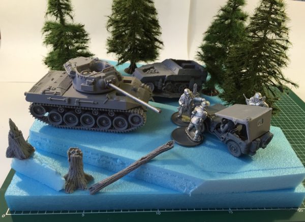
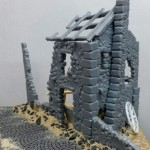
Ardennes Defence in progress – Warlord RichC
RichC: It’s only been a couple of weeks since we launch the Diorama competition, however the Warlord Forums have been a-buzz with ideas and inspiration being passed around!
Here are just a few examples of some of the ‘Work in progress’ dioramas…
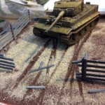
stevepalffy
Steve’s working on a small Normandy Diorama – titled ‘Hostile Environment.’
The plan is for it to feature a Tiger of 102 SS heavy Tank… which were almost completely wiped out in Normandy…(hence the diorama title!)
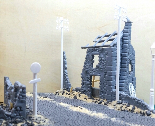
Note the great use of balance and the observation of a golden rule: never put anything parallel to the edge of the base!
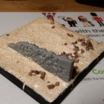
bigbenrolls
Ben’s working on a Winter scene – featuring one of our Winter Soviet miniatures hiding behind a wall in the snow, whilst a German Medic (from our Winter German HQ set) helps a wounded soldier away from the front line.
Here’s his progress so far;
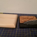
A good use of cork tiles to create the base of Ben’s slope will provide balance with hight behind the wall. Adding the fir trees in this scene overhanging the base will disrupt the edges of the square making it look more natural.
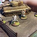
Patchimus
Patch is working on a winter scene in which a tank and some supporting infantry are conducting a fighting withdrawal through a field.
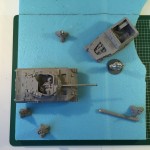
By test fitting with the actual models Patchimus can visualise the final effect. A great way to plan those little details that’ll make your diorama outstanding.
Tips to try for your entry:
Planning is key!
Try sketching out your ideas with a story or series of smaller stories in mind, you may come up with a dozen but try to just pic 2 or 3 that stand out and save the others for another project. Use the actual models or parts of models to get proportions, balance, and narrative all working together.
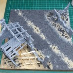
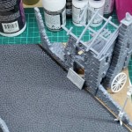
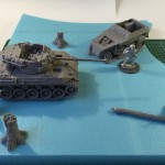
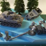
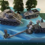
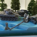
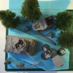
Here’s my Ardennes project going through the planning phase:
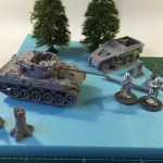
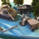
My Ardennes idea is to have the M18 Hellcat awaiting orders with a burnt and wrecked SdKfz250 in the background – here the layout starts a bit empty, level, and too spaced out. I’ve angled the tank and raised the height of the road, adding the characters to help visualise the scene.
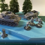
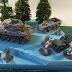
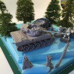
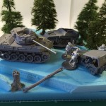
I’ve now added a jeep to balance the effect, if I have the tank commander talking with the officer over a map on the bonnet the story starts developing. Moving the burnt halftrack around and adding trees to create an amphitheater/backdrop, then re angle the jeep so it’s not parallel to the halftrack but more as though it’s naturally swerved to a stop across the path of the tank.
Angling the turret brings the gun around to direct the viewers eyes toward the jeep and the activity around it. I’m fairly happy with the concept now. From experience though I’m sure there’ll be plenty more slight changes as I move on to ground work then detailing later in the new year.
TopTip: Pay close attention to where your figures are looking, pointing, or moving. Have a watch of this excellent Warlord Wednesday video by TemplarsCrusade01 which clearly details a way of telling the story, or in other words provide narrative through composition:
More Balance;
in positioning your model(s) on the base it’s best to observe an important rule: never put anything parallel to the edge of the base!
Remember the diorama is an illusionary snap shot of a moment in time, straight edges are not a normal occurrence in nature. An angle of as little as 5 degrees is enough to fool the eye.
What balance means is in nutshell this; every diorama has a right side, middle, and left side, there should always be something to engage the viewer in each section. If the diorama was ‘balanced on a point in the centre and if there were one big item (tank or other visual piece) on the left side then there would need to be several smaller items (infantry or equally weighted amount of visual pieces) on the right side.
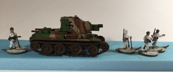
A good balance feels natural to your eye.
The heavy BT-42 Assault Gun is balanced by being just left of center with more Ski Infantry to the right than behind.
Less Symmetry;
don’t be afraid to experiment, its important that whilst balancing the layout you don’t get carried away with precise angles or measurements. It’s rare in nature to find anything perfectly aligned, and that goes for your base too. Once you have an idea, see if you can make the base fit by altering it’s shape rather than making your diorama fit the base.
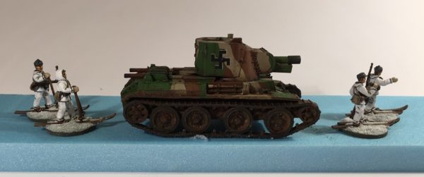
Unless on parade this looks too staged.
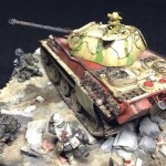
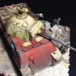
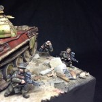
Even tricks like the tiles/bricks edging the road on Charlie Brebner’s diorama of a Panther in Berlin (below) do enough to trick your eye into imagining the road continuing on into the distance.
Combine all the elements; the movement apparent in the infantry, balancing the amount of foreground visual information against the visual of the tank, the turret turned and directing the viewers eye down the barrel toward the imagined action further down the street, and you have all the elements to create the winning picture. The painting always helps too…
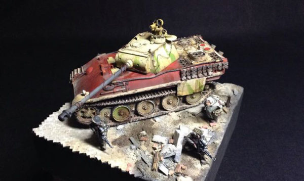
Panther Ausf G with Sperber Infra Red sights – Charlie Brebner, Bolt Action Paint Off winner 2015
2016 Diorama Challenge
All the details for the 2016 Diorama Challenge can be found here, it’s never too late to start your masterpiece, you’ve even got until March to get it ready. So have a great Christmas and get building, Good Luck! RichC
