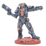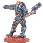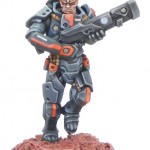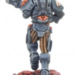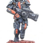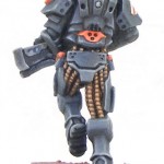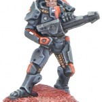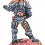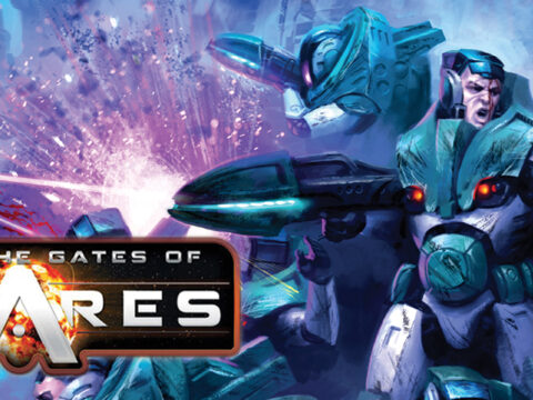
Here we have a first look at an Algoryn AI squad painted by the very talented painter Jo Bain. Not only did he paint these miniatures for the forthcoming Beyond the Gates of Antares releases he also took the time to take us through his thoughts on the colour scheme he used for his squad, so over to Jo!
From the information that is available on the Algoryn, the military culture aspect seemed defining. More than just a military unit in a regular culture it suggested a utilitarian regard for arms and armour, not a lot of frippery. On the other hand, they’d have a lot of military units so some identifying marks would be necessary.
I fancied the armour to look heavy rather than some ceremonial garb. Dark tones have a greater weight than more bouncy looking light tones, and those lads look to sporting some heavy gear by the size of the head/neck into the suit. A blue grey works nicely with white and black for the shading/highlighting and doesn’t look poncy if kept dark.
If the undersuit is lighter that helps reinforce the suggestion of heavy armour. A neutral, non-distracting shade of brown that could be as the material comes rather than dyed for cosmetic also backs up the utilitarian notion.
Weapons in factory black. Simple and strong imagery, and overly glinty metallics seemed counter to sneaky manoeuvres.
All the recessed rivets on the armour had previously got me thinking they could be glowing with light from within, the power of the power armour. That didn’t work on closer inspection, but would do for the weapons. A indicator of remaining power and glowing barrels, looked interesting. Didn’t let the notion a constant light and torch effect out the barrel bother me to running counter to those sneaky manoeuvres, figure one of the switches on the weapons can shutter that effect. Brainy eh?
Being evolved humans I didn’t deviate far with skintones. The chitinous plates were initially to go in a different direction, bone plates pushed through skin to blacken at the edges, a reverse of the typical shading/highlighting dynamic. On reflection it looked too confusing, and would be a nightmare to render if they were to also still be shaded and highlighted on top of all that. Let myself be swayed by the animals whose horns are actually made up tightly compacted hair.
There’s a couple different markings on the armour. The orange trim serves as a visual unit/company identifier (also a nice way to pick out the nicely sculpted details as on the belt pouches), which also contrasts nicely against dark blue-grey.
A more technical identifier is aimed at in the white panels. I figure what sensors they use can pick up on those, containing a futuristic barcode and/or chip technology. Both the orange and white are present front, side and back.
The differing structure of the orange marking on forearm and chest was put to mind by the sculpted detail on their left shoulder pad and chose to echo that while presenting an individual. The length of the wider band could indicate length of service, the width the quality of that experience and/or rank, additional strokes could suggest multiple tours or campaigns.
I avoided too many stages of highlight on the weapons with the aim of keeping them suitably dull and matt. More highlights would suggest a glossier high contrast texture (or even start to look like a ropey attempt at non-metal metallics – a fad I’m waiting to die off).
I also wanted to avoid more edge highlighting than I managed. We’ve seen too much of that elsewhere the last few years, currently I am favouring greater emphasis on tonal ranges. I also prefer linear highlights, working from a directed light source rather than light that illuminates the whole model equally. In practice, I think it could use more practice.
With the dark blue grey having say, seven shades between the darkest and lightest for the various angled plates, then applying the next stage or two for some edging would be easier if each of those stages had been mixed up and stored in a wet palette. As it was I was going back and forth between the stages more than I otherwise could have.
Some of that back and forth resulted in areas that rubbed off. From the way I was holding the model. So that’s something else I’d have done different, stuck each base to a cork to be able to hold them without rubbing paint off.
Finishing with the bases the design comes from the necessity to obscure the integrated base upon the wooden discs. Once glued, putty was added to built them up and mask the join. Chips of slate were then slid into the putty and the putty smoothed . Later, textured paint was glooped on the rest and the whole painted through a terracotta up to white for a red moon/Mars look.
In summary a pleasure to paint. Well sculpted. Details reaching out for brush and paint and actively helping the process. Could be a great army to paint as there is no reason they all need to sport the same base colour. Each unit could have a different armour colour and leave bases and weapons to inject the army cohesion effect.
