Painting and building for the Antares Initiative with the October Wargames Association!
By Mark Croft
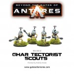
I’ll start with the easiest elements, the Ghar outcasts and tectorists, these came as white metal casts with a good level of detail and with minimal clean up needed, the poses are great and add some nice character to the army. I cleaned them up and glued them directly to the supplied plastic bases. There is some debate about removing the metal foot they are attached to but I have so far always left these on and built up the basing material around them to hide the ledge.
Painting wise I liked the pallid, ill looking flesh on the box art and decided to go with the “traditional” scheme. After priming the outcasts (Halfords grey plastic primer) I started batch painting the flesh, with a base coat (GW Rakath Flesh), first layer (GW Flayed one flesh), wash(GW Rieksland Flesh) and highlight (GW Pallid Witch Flesh). Once the flesh was done I added the broad detail such as the cloth elements (Black) and metal (GW Lead Belcher)which then had a wash (GW Nuln Oil) applied where appropriate. I added a link to the main Ghar battle suits by using the same colour as the armour (a medium grey) on the gun plating and the leader and tectorist equipment. I then added final details such eyes, claws and the suit connection sockets.
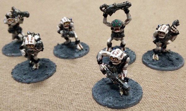
I liked the contrast in colours to the main Ghar suits that the outcasts provided but by using the same colours, the grey armour, gun metal and blue connection sockets as well as having the same bases there was a strong link between the various army elements.
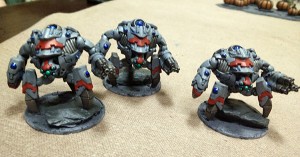
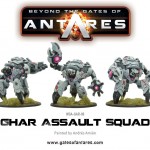
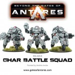
The battle suits I was able to test build with the Drone integration scenario set, although they were fairly straight forward to build as well. I found them best to build in sub-assemblies of the torso, legs and then attach the arms and head afterwards. The legs didn’t initially appear to look right to me following the instructions so I tried the pieces connecting the leg to the hip upside down and found this to look better, when I recorded the freeborn shard podcast I talked to Tim about this and he said he had done the same, as had a few other people online, something I found reassuring but now need to remember to do to all my battle suits! Before I finalised the position of the legs I attached some slate to the bases to help give some slightly more dynamic poses of clambering over the rocky terrain of Selina, especially for the Assault Squads who I wanted to have a look of forward momentum about them. The legs adapted well to this uneven surface and I achieved the look that I wanted with them giving some extra variety to the poses.
I used the same head for each unit type, I like the uniform military idea behind Ghar society so chose one head for each suit and stuck with that. Though I have seen some use the heads to denote ranks. The rest of the assembly was straight forward and I moved onto painting them.
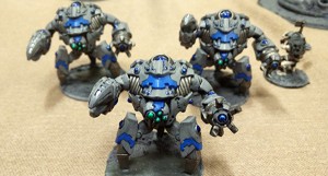
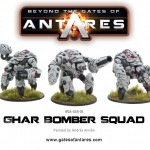
I initially wanted a blue grey look to the armour and painted up a test piece, I again started with a grey undercoat primer, and I then applied a base coat (GW shadow grey) and a black wash. I did try a brown wash was though I felt the black looked better, I then went back over the armour with shadow grey and then applied the gunmetal elements (vents, pipes, guns and lower leg) . To help break up the mass of grey I opted for some brighter colour highlights with the intention to change the colour based on unit function, red for battle suits and blue for assault squads, with a stripe to each leg, the upper armour plate and the head. Further details were added in the plasma points on the suits keeping these the same across all types.
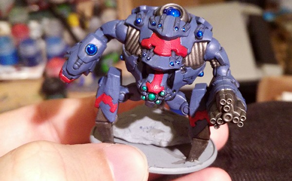
I then left the test model overnight looking at it every now and again but thinking it didn’t seem quite right. It was at this point I decided to repaint the armour plates a medium grey in tone. I applied the grey to all the armour plates and was a lot happier with the results and began applying this new scheme to all the suits.
Finally to differentiate between the leader and regular suits I added some markings to the leaders head piece, just a simple white stripe and a dot next to it, higher rank leaders I’ll add additional dots to when they get added to the force.
Terrain
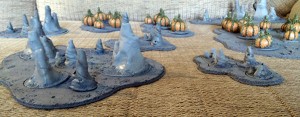
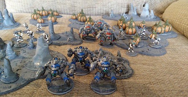
We have read through the description of Selina several times and had group discussions on how we want the planet to look and feel. The general consensus is that it will be grey, rocky and dead (as per the description). Which while it sounds like an interesting and different board style to what we normally play on (green and wooded) it will be very grey. We decided that to break this up we will use bright colours on the buildings to give them a very prefab out of place look. We will also create some mud pools, rock formations and craters to move on and around.
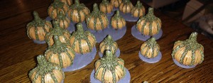
The biggest problem we found was the commonly referred to “space onions”, our planet was described as dead with no life forms so our initial idea was to make them into fossilised plants. We thought that with a grey matt, and grey rocky terrain that would be a rather uninteresting terrain feature. Instead we drew inspiration from both the club name and time of year and opted for… SPACE PUMPKINS! With the intention that they are a weed know to grow in difficult inhospitable terrain and brought to worlds by unknowing freeborn spreading the spores from their vessels and vehicles. This let us break up the boards colour and provide a nice eye catching terrain piece and talking point.
The barriers will be painted grey but I lighter tone to the rocky terrain, I really liked how they can be active and inactive which can add some great narrative to games. Especially with surprise attack scenarios or power generators being priority targets. Just a shame they don’t look very Ghar!
Do you have an article within you? Are you itching to show your collection to the world? Join our Beyond the gates of Antares facebook page for the most up to date news and more!
Start your Ghar army right now!
Pre-order Strike on Kar’a Nine, coming January 2017!
